
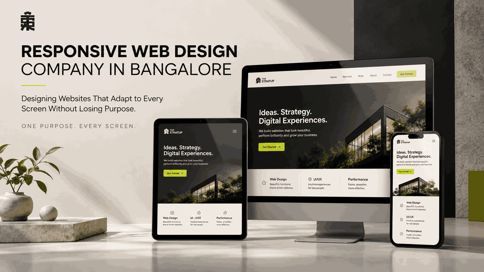
A website needs to work wherever visitors choose to open it. Responsive Web Design Company in Bangalore solutions focus on creating websites that remain clear and functional across desktops, laptops, tablets and smartphones, allowing visitors to interact with the same brand experience without unnecessary adjustments.
The challenge is that each screen offers a different amount of space. A wide desktop can accommodate multiple columns and expansive visuals, while a smartphone requires content, navigation and interactive elements to be arranged more carefully. The website needs to respond to these differences without making the experience feel disconnected.
Responsive web design is therefore about more than shrinking or stretching a webpage. It involves creating flexible layouts, adaptable typography, responsive images, practical navigation and touch-friendly interactions that change according to the available screen space.
Mobile Design Should Preserve the Website’s Purpose and Clarity Everywhere
When a desktop layout is transferred directly to a phone, problems quickly become visible.
Text can become difficult to read. Navigation can feel crowded. Images may dominate the screen. Buttons may become too small to tap comfortably. Important information can be pushed far below the first view.
Responsive design addresses these problems by reconsidering how each element behaves at different sizes.
The question is not simply:
“How can this desktop layout fit on mobile?”
It is:
“How should this website experience work on mobile?”
That distinction matters.
A Responsive Web Design Company in Bangalore should consider mobile behaviour while planning the layout, rather than treating responsive design as a technical correction after the desktop version is complete.
Typography Needs Responsive Thinking Too, Not Just Smaller Font Sizes
Text is one of the most noticeable parts of any website, which makes responsive typography especially important.
A heading that looks balanced on a desktop monitor can occupy most of a mobile screen. Paragraph widths that feel comfortable on a laptop may become too narrow or too wide elsewhere.
Responsive typography considers:
- Font size
- Line height
- Letter spacing
- Heading length
- Paragraph width
- Text spacing
- Visual hierarchy
The objective is not to make everything smaller.
Instead, typography should remain readable while maintaining the intended hierarchy of the page.
A primary heading should still look important on mobile. Supporting information should remain easy to scan. Buttons and labels should remain understandable without requiring excessive zooming.
This is another area where Responsive Web Design Company in Bangalore expertise can make a visible difference to the final experience.
Navigation Should Change With the Screen Without Losing Familiarity
Navigation often requires one of the biggest adjustments between desktop and mobile.
A horizontal desktop menu may have enough room for several options. A smartphone does not.
Responsive navigation can therefore use a compact menu, reorganised categories or other mobile-friendly patterns.
But the underlying structure should remain familiar.
Visitors should not feel that they are entering an entirely different website when they move from desktop to mobile.
Important pages should remain accessible. Labels should remain understandable. Menu interactions should be easy to operate with a finger.
The design challenge is to reduce visual complexity without reducing access to useful information.
Images and Media Should Adapt Without Becoming a Performance Problem
Images can transform a website visually, but large media files can create problems on smaller devices.
A responsive website needs to consider both appearance and delivery.
Images should scale appropriately within their containers. Important visual content should remain visible when layouts change. Cropping should not accidentally remove meaningful parts of an image.
At the same time, unnecessary image weight can affect loading performance, particularly for visitors using mobile connections.
Responsive design therefore works closely with image optimisation.
THE STRATUP considers these details when creating Responsive Web Design Company in Bangalore solutions so that visual quality does not come at the cost of usability.
Touch Interactions Need Different Design Decisions on Mobile Screens
Desktop visitors generally interact using a mouse or trackpad. Mobile visitors use their fingers.
That difference affects how interactive elements should be designed.
Links and buttons need enough space to tap comfortably. Forms should avoid unnecessarily tiny fields. Dropdowns and menus should be easy to operate. Interactive areas should not be positioned so closely together that accidental taps become common.
These details may seem small, but they influence whether a mobile website feels effortless or frustrating.
Responsive design is therefore partly about recognising how people physically interact with different devices.
A website that looks perfect but is difficult to operate on a touchscreen is not delivering a complete responsive experience.
Forms Must Remain Simple When the Screen Has Less Space Available
Forms often become longer and more difficult to use on mobile devices.
A desktop form may comfortably display several fields across a row. On a phone, those fields need to stack vertically.
The design should also consider the type of information being requested.
Shorter forms can reduce unnecessary scrolling. Clearly labelled fields make completion easier. Appropriate input types can make mobile entry faster.
For example, a phone number field can trigger a numeric keypad, while an email field can provide a keyboard suited to email entry.
These small design decisions make the website feel more responsive to the user—not just the screen.
Responsive Design Should Keep Brand Identity Consistent Across Devices
Adaptability should never mean losing the brand.
Colours, typography, imagery, visual tone and key design patterns should remain recognisable whether the visitor opens the website on a desktop or smartphone.
However, consistency does not mean identical layouts.
A desktop page may use generous horizontal space, while the mobile version may use a vertical structure. A large image gallery may become a swipeable sequence. A complex navigation system may become a compact menu.
The presentation changes, but the identity remains.
A Responsive Web Design Company in Bangalore can build this balance into the design system so that responsiveness becomes part of the brand experience rather than an afterthought.
Testing Across Real Devices Reveals Problems Designers Cannot Always See
A responsive website can look correct in a design file and still behave differently when people actually use it.
Testing should cover different screen sizes and orientations to identify issues such as:
- Text wrapping unexpectedly
- Buttons becoming difficult to tap
- Images being cropped incorrectly
- Navigation becoming confusing
- Sections creating excessive scrolling
- Forms becoming uncomfortable to complete
- Elements overlapping at unusual widths
Testing also needs to consider how the website behaves when the screen orientation changes.
Real-device testing provides a more realistic picture than checking only one desktop browser window.
This is an important part of Responsive Web Design Company in Bangalore projects because responsiveness is ultimately about how the finished website behaves outside the design environment.
The Best Responsive Websites Adapt Without Making the Change Obvious
Good responsive design often goes unnoticed.
Visitors are not thinking about grids, breakpoints or flexible containers while browsing. They simply expect the website to work.
They expect the heading to be readable. They expect the menu to open. They expect images to fit. They expect buttons to respond. They expect forms to be manageable.
When all these details work together, the technology behind the experience disappears.
That is the real strength of Responsive Web Design Company in Bangalore services: the visitor experiences a website that feels natural regardless of the device being used.
A Responsive Website Should Adapt Without Losing Its Original Purpose
A website should still communicate clearly on mobile. Its navigation should still make sense. Its pages should remain connected. Its images should support the content. Its forms should remain usable. Its brand identity should remain recognisable.
THE STRATUP approaches Responsive Web Design Company in Bangalore projects by treating adaptability as a fundamental part of website planning.
A desktop visitor may experience wide layouts and expansive visuals. A mobile visitor may experience focused content, stacked sections and simplified navigation. Both should arrive at the same destination: a website that is clear, usable and purposeful.
Ultimately, responsive web design succeeds when visitors never have to think about the device they are using. They can simply browse, read, interact and move forward.