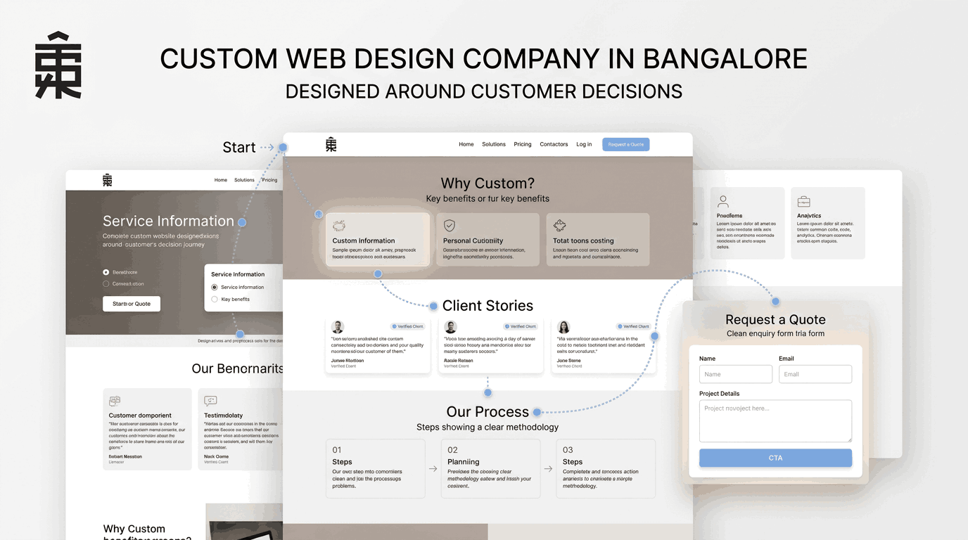
A visitor rarely lands on a website knowing exactly where they will click next. They scan the headline, notice the navigation, look for relevant information, open another page and gradually decide whether the website has what they need. Good website design accounts for this behaviour before the first page is built.
Visitors may arrive on a homepage, service page, portfolio, landing page or even a blog article. From there, the design needs to help them understand where they are, what they can find and where they can go next. When these elements work together, browsing becomes easier and the website feels naturally organised.
This is the thinking behind Custom Web Design Company in Bangalore solutions at THE STRATUP. Rather than relying on a fixed layout and filling it with content, the website can be structured around how people actually explore, evaluate and interact with digital experiences.
The First Screen Should Give Visitors a Clear Starting Point
The opening section of a website establishes the direction of the entire browsing experience.
Visitors should not have to search through multiple sections to understand what the website represents. The main heading, supporting text and primary visual should work together to establish context immediately.
A strong first screen usually answers three basic questions:
- What does this website offer?
- Who is it intended for?
- Where can the visitor go next?
This does not mean filling the opening area with excessive information. In fact, reducing unnecessary content can make the page easier to understand.
The design should create a visual starting point and then provide a natural route into the rest of the website.
Website Navigation Should Follow the Way Visitors Explore Pages
Navigation is more than a menu placed at the top of a webpage. It is the framework that connects the website together.
When navigation is unclear, even useful content becomes difficult to discover. Visitors may know that the information exists but still struggle to reach it.
A thoughtfully designed navigation system considers the relationship between pages. Core services should be easy to access. Important supporting pages should have logical connections. Contact options should not disappear after the homepage.
For a Custom Web Design Company in Bangalore, this means navigation can be planned around the specific website rather than forcing the business into a standard menu structure.
Simple navigation often works best because it reduces the number of decisions visitors have to make before reaching useful information.
Place Proof Where Visitors Naturally Begin to Question the Website
Proof works best when it appears at the point where visitors are making a decision.
- Introduce the business first
The homepage can establish who the company is, what it offers and who it serves. - Show proof alongside services
When visitors explore a service, relevant projects, results or client examples can reinforce the information immediately. - Match proof to the page purpose
Different pages can use different credibility elements:
- Portfolio: Completed projects
- Service pages: Relevant work examples
- Case studies: Detailed project outcomes
- Testimonials: Client experiences
- Certifications: Expertise and qualifications
- Avoid hiding all credibility in one place
A separate testimonial or portfolio page may be useful, but visitors should not have to leave the page they are evaluating to find evidence. - Connect claims with evidence
For example:
Service → Project Example → Client Result → Enquiry
This approach is one of the strengths of working with a Custom Web Design Company in Bangalore, because the website can be structured around how visitors actually evaluate the business rather than following a fixed template.
Calls to Action Should Feel Like the Next Logical Website Step
A CTA should not appear simply because every website is expected to have one.
Its placement should make sense within the page.
After introducing a service, a visitor might want to explore related information. After viewing a portfolio, they may be ready to discuss a project. After reading an informative article, they may want to explore a relevant service.
The design can accommodate these different moments.
Instead of repeating the same button everywhere, websites can use context-driven actions such as:
- Explore the Service
- View Related Projects
- Discuss Your Requirement
- Request a Consultation
- Get in Touch
The objective is not to push visitors into action. It is to make the appropriate next step visible when they reach it.
Mobile Websites Need the Same Decision Logic in Less Space
A website that works well on desktop can still create problems on mobile.
Navigation may become harder to use. Important information may move too far down the page. Buttons may become difficult to tap. Large visual elements may consume valuable screen space.
Responsive design should therefore involve more than shrinking desktop elements.
The mobile version should preserve the logic of the website while adapting the experience to a smaller screen.
Content hierarchy becomes particularly important here. Visitors should still be able to understand the page, identify important information and move between sections without unnecessary effort.
A Custom Web Design Company in Bangalore can account for these differences while planning the website rather than treating mobile responsiveness as a final adjustment.
Every Page Should Give Visitors a Reason to Continue Exploring
- Service → Projects: Show relevant work after explaining a service.
- Projects → Services: Help visitors understand the service behind each project.
- Blogs → Related Pages: Guide readers toward relevant services or resources.
- About → Expertise: Connect the company story with its skills and process.
- Use Internal Links: Create clear paths between related pages.
- Add Contextual CTAs: Give visitors a relevant next step.
- Avoid Dead Ends: Every page should guide visitors somewhere useful.
- Custom Structure: A Custom Web Design Company in Bangalore can build these connections around the website’s actual content and user journey.
Website Forms Should Remove Unnecessary Friction From Enquiries
The final stage of a website journey can often be affected by something surprisingly simple: the enquiry form.
A form asking for too much information can discourage visitors. A form that provides no context can make the interaction feel uncertain.
The design should make the purpose of the form clear and ask only for information that is genuinely useful at that stage.
Labels should be understandable. Fields should be easy to complete. Error messages should explain problems clearly. The submit action should communicate what happens next.
Small details such as these can significantly influence how comfortable visitors feel when moving from browsing to interaction.
Build Website Structure Around Behaviour Rather Than a Fixed Template
Templates can provide a starting point, but every business has different information, services, audiences and website goals.
A website for a professional service company may need detailed service pages and case studies. An online business may require stronger product discovery and checkout journeys. A creative studio may need its work to become a central part of navigation.
This is why custom design is not simply about making a website look different.
It is about deciding how the website should work.
THE STRATUP approaches Custom Web Design Company in Bangalore projects by considering the relationship between pages, content hierarchy, navigation, responsive behaviour and user interaction from the beginning.
The result should not be a collection of individually attractive pages. It should be a connected website where each section has a clear role.
A Better Website Makes the Next Decision Easier for Every Visitor
Customers may make different decisions at different points, but the website can help make each one easier.
At THE STRATUP, the focus is on creating websites where design and functionality support the visitor at every stage. From the first screen to the final form, the structure should feel intentional rather than accidental.
A successful website does not need to control every click. It simply needs to make the right clicks easier to understand.
When navigation is clear, content is organised, visuals have purpose, pages connect naturally and actions appear at the right moments, the website becomes more than a digital presence. It becomes an experience designed around how visitors actually use it.
That is where Custom Web Design Company in Bangalore becomes less about customising appearances and more about building a website that genuinely fits the people using it.